Four extra sets of interactive sports participation dashboards have been announced to help the sports industry understand participation trends in America in more depth than ever before.
The new products, operated by Sports Marketing Surveys (SMS) and the Sports and Fitness Industry Association (SFIA), follow the announcement of the 88-sport dashboard at the end of 2020 and make the information more accessible to those sports federations, brands and retailers interested in understanding participation trends in specific sporting areas.
Dashboards are now available covering team sports (includes 24 sports to compare), fitness sports (26), outdoor (27), and action sports (9). With prices starting from under $3,000, the new service will be of interest to businesses of all sizes.
Each includes a specific set of reports taken from the annual Physical Activity Council (PAC) participation insights, a robust research series described as “the gold standard in sports participation” by ESPN.
Sports can be quickly compared on a series of carefully prepared metrics designed to make the insights richer and more actionable. The database holds six years of trend data to allow for sport and cross-sport patterns to be analysed over time, and buyers can also download all charts as image files for easy inclusion in reports and strategy documents.
Six different types of charts can be viewed, which, when combined with a carefully selected series of filters, allow for almost infinite combinations of data.
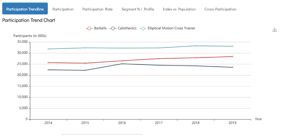
In the below chart, we have compared three sports from the fitness dashboard. As the image shows, users can view overall participation trends over the past six years, before switching to view by profile, index each sport’s participants against the general population or view cross-participation, which looks at the other sports played by participants and helps identify marketing opportunities and range expansion possibilities.

]The view below shows what happens if a user changes to segment % / profile view, designed to show change over time in the make up of sports participants. The demographics in the table can be freely chosen by participants. In this example we chose to focus on males, 18-24 year olds and those earning under $25,000

The freedom to filter and tailor the data is crucial to allowing users to narrow their search to particular sub-groups. This is important for customer targeting and also means that the dashboard is just as valuable to those businesses targeting specific population sectors as it is to those trying to grow participation or client base at a macro level.
The detailed demographic filters allow for a selection by gender, age, region, income or education level, while the participant type toggle allows buyers to focus on core or casual participants (defined by play frequency) or to view the full dataset. Users can select up to five sports for comparison at once.[

Keith Storey, President of Sports Marketing Surveys USA, reflected on the new insights and how they are supporting some of SMS’ longstanding clients who have been testing the service. “The data from the PAC participation programme has been a game changer for federations, brands and retailers for some time. But I can honestly say that it’s never been more true than it is now. The dashboard is designed for those businesses that want to compare and benchmark participation levels in different sports, helping make data led decisions on programmes to offer, demographics to target, and also on product buying / inventory. Some of the major manufacturers and sports federations in the USA have already bought into the service, and the early feedback is that the data has been vital to their planning for 2021 and beyond.”
Pricing for each dashboard is shown below


